Bitcoin eyes a breakout toward $82K as exchange outflows signal reduced sell pressure, long-term holders continue accumulating, and rising open interest points to an incoming volatility-driven move. | Source: CCN.com
Share
Key Takeaways
Persistent net outflows from exchanges suggest reduced sell pressure and tightening supply, supportive of a potential breakout.
HODL Waves show strong retention among long-term investors, indicating continued conviction and a lack of late-cycle profit-taking.
With fewer coins available on exchanges and strong hands holding, Bitcoin may face less resistance if demand increases.
Rising open interest during consolidation suggests traders are positioning for volatility, often a precursor to breakout conditions.
Bitcoin is once again hovering near a critical inflection point. After consolidating below the $80,000 region, traders and investors alike are asking the same question: is the next major move a breakout toward $82,000 and beyond, or a rejection fueled by hidden sell pressure?
Price alone rarely tells the full story. To understand whether this rally has real backing, it’s essential to dig into on-chain flows, long-term holder behavior, and derivatives positioning. Together, these three lenses offer a much clearer view of market structure and intent.
Here are three key charts that suggest Bitcoin may be gearing up for a breakout, and what could invalidate that thesis.
Bitcoin Exchange Netflow Analysis: Why Outflows Signal Reduced Sell Pressure
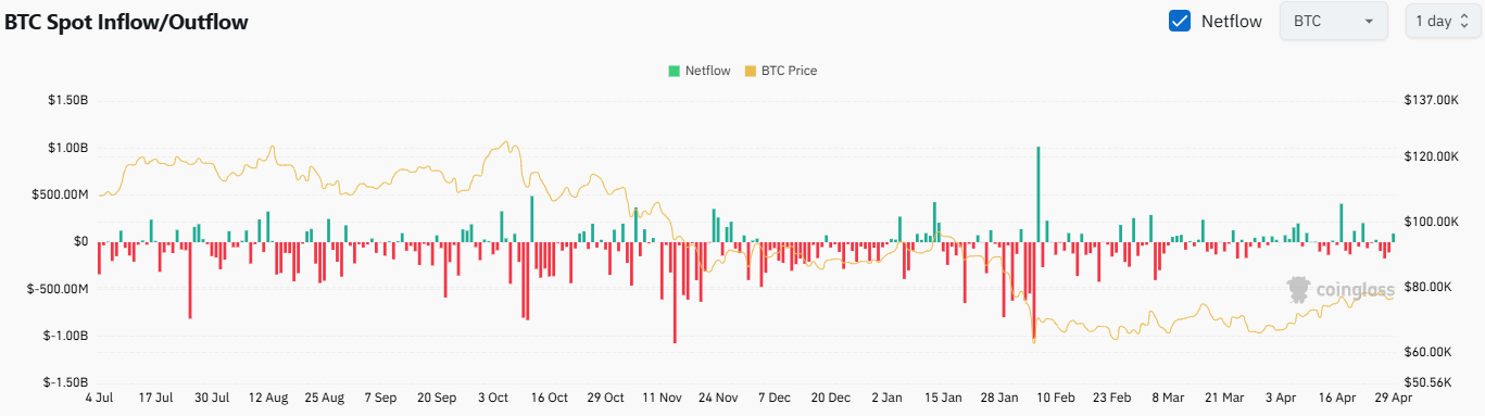
The Coinglass BTC Spot Inflow/Outflow chart provides one of the most immediate reads on market intent. At its core, it answers a simple but powerful question: are coins moving toward exchanges (potentially to be sold), or away from them (likely into cold storage)?
This distinction is crucial.
Inflows (coins moving into exchanges): Often signal potential sell pressure..
Outflows (coins leaving exchanges): Suggest accumulation and reduced available supply.
Over the past several months, the chart shows a persistent trend of net outflows, punctuated by only brief spikes of inflows. Even during periods of price weakness, exchange balances have not meaningfully increased.
That’s important.
BTC spot inflow/outflow. | Credit: Coinglass
Historically, strong rallies tend to be supported by declining exchange reserves. When fewer coins are readily available to sell, upward price movements face less friction. This dynamic creates what’s often referred to as a supply squeeze.
Recently, the netflow trend appears relatively neutral-to-negative (i.e., more outflows than inflows), even as Bitcoin stabilizes in the high-$70,000 range. This suggests that:
Large holders are not rushing to sell into strength.
Coins are continuing to move into self-custody or long-term storage.
Available supply on exchanges remains constrained.
There are occasional spikes in inflows, visible as sharp red bars, but these have not sustained long enough to shift the overall trend. Instead, they appear more like short-term profit-taking events rather than structural distribution.
Why This Matters for $82,000
For Bitcoin to break above resistance, it needs not just demand, but a lack of supply. Exchange outflows directly support that condition.
If this trend continues, it strengthens the case that any breakout attempt toward $82,000 is backed by genuine accumulation rather than speculative froth.
However, a sudden reversal, marked by sustained inflows, would be an early warning sign that participants are preparing to sell into strength.
Bitcoin Long-Term Holder Supply and HODL Waves: Are Investors Still Accumulating?
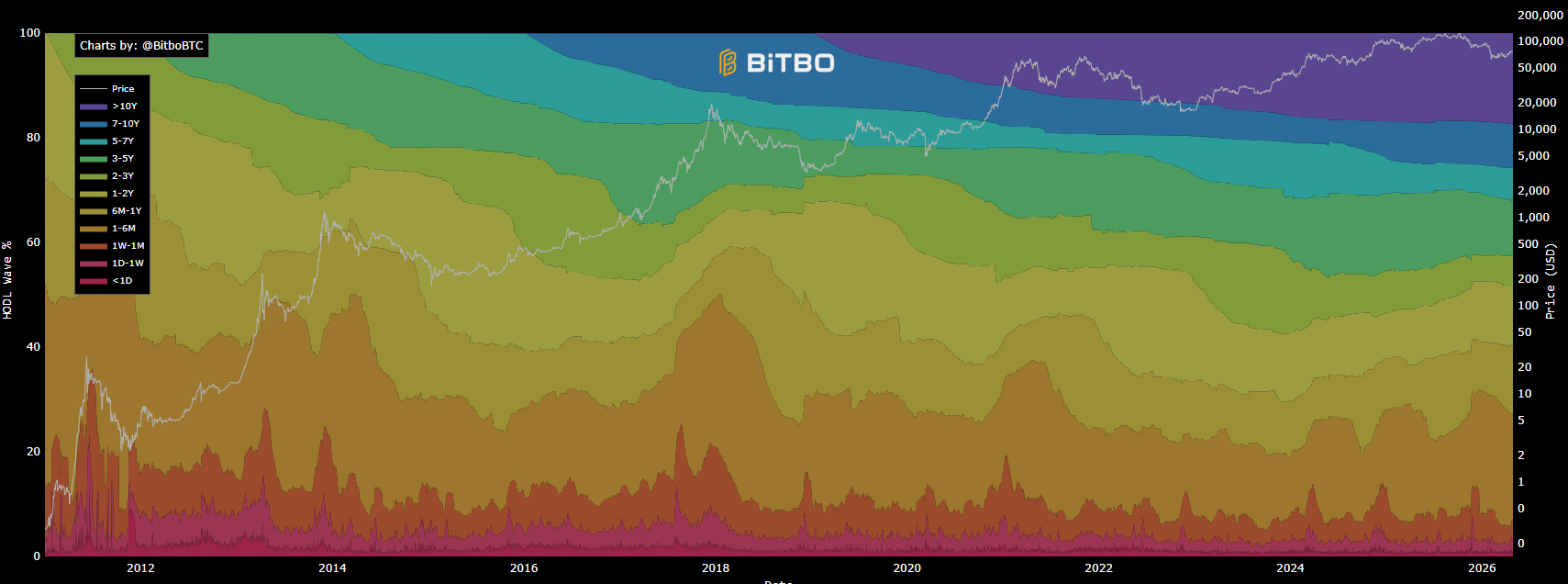
While exchange flows capture short-term intent, HODL Waves provide a deeper, cohort-based view of who is holding Bitcoin, and for how long.
This chart segments Bitcoin supply by the age of coins, effectively tracking how long BTC has remained dormant. It serves as a proxy for long-term holder behavior without relying on entity-level assumptions.
Falling long-term holder supply: Distribution phase
Looking at the current structure, long-duration cohorts, particularly coins held for one year or longer, continue to expand or remain elevated. This suggests that long-term holders are largely holding through current price levels rather than distributing.
At the same time, shorter-duration cohorts (newer coins) fluctuate more actively, reflecting trading and speculative behavior. But critically, there is no significant expansion in short-term supply that would indicate aggressive profit-taking by long-term participants.
This pattern aligns with a classic mid-to-late cycle consolidation phase, where:
Long-term holders retain conviction
New entrants absorb available liquidity
Supply gradually tightens over time
What’s especially notable is that even as Bitcoin approached recent highs near $80,000, there hasn’t been a meaningful decline in older coin bands. In past cycles, sharp reductions in long-term holder supply often preceded local tops, as early investors distributed into strength.
That signal is currently absent.
The Bigger Picture
This behavior suggests that the market is still in an accumulation-driven structure, rather than a distribution phase. Long-term holders, who historically sell into euphoric conditions, are not yet signaling that the market has reached that stage.
In other words, the “strong hands” are staying put.
Implications for a Breakout
When long-term holders are not selling, it reduces overhead supply. Combined with steady demand, this creates favorable conditions for price expansion.
If Bitcoin pushes toward $82,000 with long-term holder supply still elevated, it would reinforce the idea that:
The rally is structurally supported.
Distribution has not yet begun in earnest.
Higher prices may be needed to trigger large-scale selling.
Bitcoin Derivatives Data: Open Interest and Funding Rates Signal Potential Volatility
The third piece of the puzzle comes from the derivatives market, specifically open interest and funding dynamics from Coinalyze.
This is where things get more nuanced.
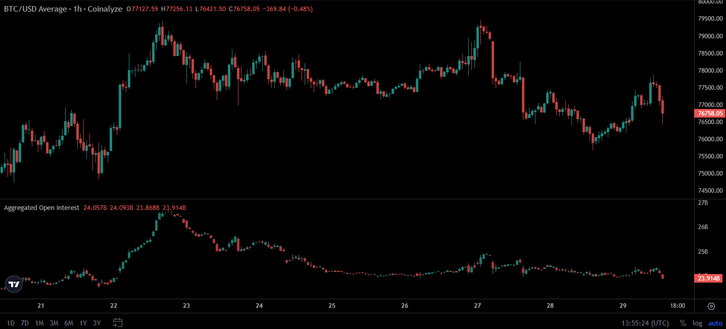
Open Interest: A Measure of Leverage
Open interest represents the total number of outstanding futures contracts. Rising open interest typically indicates increasing participation and leverage in the market.
Recent data shows:
A gradual buildup in open interest during consolidation.
No extreme spikes that would indicate overcrowding, yet.
A slight uptick alongside price recoveries.
This suggests that traders are positioning for a move, but the market is not yet excessively leveraged.
Excessive open interest can lead to liquidation cascades.
At present, we appear closer to the former.
Bitcoin open interest chart. | Credit: Coinalyze
Funding Rates: Who’s Paying to Stay in Position?
Funding rates reveal whether long or short traders are paying a premium to hold positions.
Positive funding: Longs are dominant (bullish bias)
Negative funding: Shorts are dominant (bearish bias)
While exact funding data isn’t shown in the snapshot, the combination of price consolidation and rising open interest often coincides with neutral-to-slightly-positive funding.
This indicates:
A mild long bias
But not an overcrowded long trade
That’s important because heavily skewed funding often precedes reversals. When too many traders pile into one side, the market tends to move against them.
Right now, positioning appears balanced enough to allow for expansion.
The Setup for a Breakout
When open interest builds during a sideways range, it typically means one thing: energy is being stored for a larger move.
That move can go either direction, but the prior two charts (netflows and HODL waves) tilt the probabilities slightly toward the upside.
If Bitcoin breaks resistance:
Shorts may get squeezed
Longs may add exposure
Momentum traders may enter
This combination can accelerate price movement rapidly, especially in a supply-constrained environment.
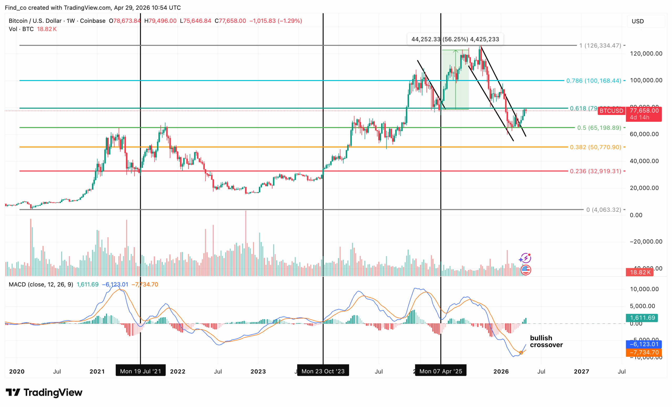
However, what matters now is the reaction after the breakdown from the all-time high near $126,000.
BTC found support around the 0.5 fib level near $65,000 and is currently pushing back into the 0.618 zone, which has historically been one of the most important levels in any trend.
The 0.618 reclaim attempt is critical. If Bitcoin’s price can hold above that level on a weekly basis, it suggests the correction was just a mid-cycle pullback and opens the path back toward the $100,000 psychological support level.
If it fails here, this becomes a lower high against the previous structure, and price likely rotates back toward $65,00 or even the $50,000 region (0.382).
Meanwhile, the Moving Average Convergence Divergence (MACD) is the interesting part, as it has printed a bullish crossover.
In previous cycles, similar crosses at this stage have marked the transition from correction back into expansion, but they still require price confirmation.
So the setup is essentially this: momentum is trying to flip bullish again, but price is sitting right under a major resistance band.
Hold above $79,000, and the market is likely to resume the broader uptrend toward $100,000.
However, if Bitcoin faces a rejection here, you’re looking at another leg down or an extended consolidation between $65,000 and $80,000.
Bitcoin Risk Factors: What Could Invalidate the Bullish Breakout?
No setup is foolproof. Several warning signs could undermine the bullish case:
Sustained exchange inflows: If large volumes of BTC begin moving onto exchanges, it would signal intent to sell, potentially capping upside.
Decline in long-term holder supply: A drop in older coin cohorts would indicate distribution, often seen near local tops.
Overheated derivatives market: A sharp spike in open interest combined with highly positive funding could signal overcrowded longs, setting the stage for a flush.
Bitcoin’s current structure reflects a market in controlled consolidation rather than exhaustion. The absence of aggressive selling, combined with steady accumulation and moderate leverage buildup, suggests that the path of least resistance may still be upward.
A breakout toward $82,000 is not guaranteed, but it is increasingly plausible given the underlying data.
As always, the key is not just watching price, but understanding the forces beneath it. Right now, those forces appear to be quietly aligning in favor of the bulls.
What is Bitcoin exchange netflow and why does it matter?
Bitcoin exchange netflow measures the difference between BTC flowing into and out of exchanges. When netflow is positive (more inflows), it can face potential selling pressure. When netflow is negative (more outflows), it typically suggests accumulation, as investors move coins into cold storage. This makes it one of the most actionable indicators for assessing short-term supply dynamics.
Do Bitcoin outflows from exchanges mean the price will go up?
Not always immediately, but sustained outflows reduce the available supply of BTC on exchanges, which can support price increases over time. When combined with steady demand, this supply constraint often creates favorable conditions for upward price movements.
What are HODL Waves in Bitcoin analysis?
HODL Waves track how long Bitcoin has been held by different groups of investors. The data is divided into “cohorts” based on holding time (e.g., 1 year+, 6 months, etc.). It helps analysts understand whether long-term holders are accumulating or selling.
Why is long-term holder supply important for Bitcoin price?
Long-term holders are typically more experienced investors who sell during periods of market euphoria. If their supply is increasing or staying stable, it suggests accumulation and strong conviction. If it starts to decline, it can signal distribution and potential market tops.
Disclaimer:
The information provided in this article is for informational purposes only. It is not intended to be, nor should it be construed as, financial advice. We do not make any warranties regarding the completeness, reliability, or accuracy of this information. All investments involve risk, and past performance does not guarantee future results. We recommend consulting a financial advisor before making any investment decisions.
Giuseppe Ciccomascolo began his career as an investigative journalist in Italy, where he contributed to both local and national newspapers, focusing on various financial sectors.
Upon relocating to London, he worked as an analyst for Fitch's CapitalStructure and later as a Senior Reporter for Alliance News. In 2017, Giuseppe transitioned to covering cryptocurrency-related news, producing documentaries and articles on Bitcoin and other emerging digital currencies. He also played a pivotal role in establishing the academy for a cryptocurrency exchange website. Crypto remained his primary area of interest throughout his tenure as a writer for ThirdFloor.
Victor Olanrewaju is a crypto analyst and reporter at CCN with deep roots in on-chain research and technical analysis. His crypto journey began in 2017, but it was the 2020 Uniswap airdrop that sparked a full-time pivot into the space.
With a foundation in copywriting, Victor honed his craft creating high-converting content for leading crypto brokers — most notably an XRP price prediction that ranked #1 on Google during the 2021 bull run.
He later joined AMBCrypto in 2022, where he combined storytelling with technical and on-chain analysis to cover key market narratives.
In 2024, he expanded his expertise at BeInCrypto, collaborating with analysts and using tools like Glassnode, Santiment, and IntoTheBlock to break down Bitcoin and altcoin trends.
At CCN, Victor covers the top cryptocurrencies, memecoins, macro shifts, blending real-time insights with deep-dive metrics.
He holds a Bachelor’s degree in Physics from the University of Ibadan, equipping him to simplify complex data for a wide audience. Follow his work or connect on LinkedIn or X.


 Easy
Easy