Fed Chair Jerome Powell has implemented policies that widen the chasm between Wall Street and Main Street. But that disparity won't last forever. REUTERS/Jonathan Ernst/File Photo
Share
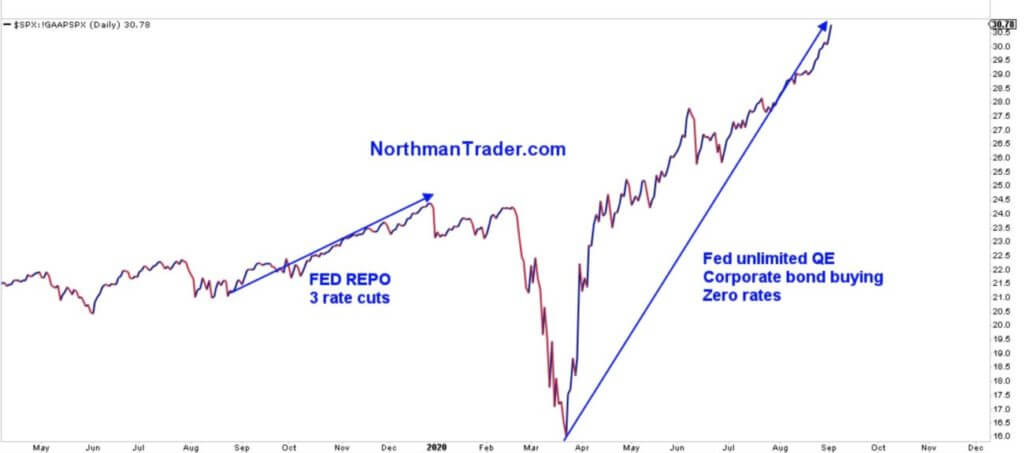
The Federal Reserve’s monetary policy fueled the recovery since the crash in March.
After hitting all-time highs on September 2, the U.S. stock market has undergone correction amid a tech selloff.
The implications of the Fed’s accommodative policies are taking effect in the form of significant distortions in the real economy, signaling a growing disparity between Wall Street and Main Street.
Ever since the U.S. stock market crashed in March, the Federal Reserve has bootstrapped equities into a mind-boggling recovery. This recovery has taken place along with an unprecedented rise in the Federal Reserve’s balance sheet and continued near-zero rates.
The Federal Reserve’s operations have fueled the S&P 500’s rally. | Source: Twitter
The Fed’s efforts have made sure the stock market staged a V-shaped recovery. Watch:
But, implications on the real economy have been devastating.
This Chart Shows the Real Implications of Fed-Fueled Recovery
The Federal Reserve ramped up its “accommodative policy” to stimulate economic activity, but all it did was cause significant distortions and boost wealth disparity.
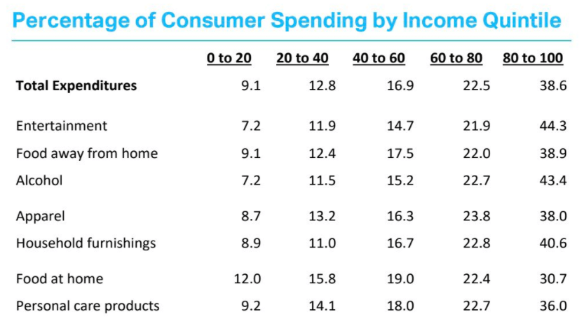
Liz Ann Sonders, Chief Investment Strategist at Charles Schwab & Co., tweeted out damning data on Thursday depicting tremendous distortions in consumer spending.
The rich are the ones doing most of the consumer spending, according to the data.
The top 20% account for nearly 40% of consumer spending in the U.S. | Source: Twitter
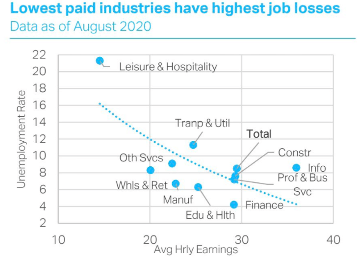
While the top earners are spending the most, low-income industries have suffered the majority of job losses. According to these data, the top 20% are responsible for 38.6% of overall consumer spending.
Low-income earners are losing their jobs at an alarming rate. | Source: Twitter
Distortions With the Real Economy Are Soaring
While the Fed keeps pumping the U.S. stock market, the situation on the ground has worsened.
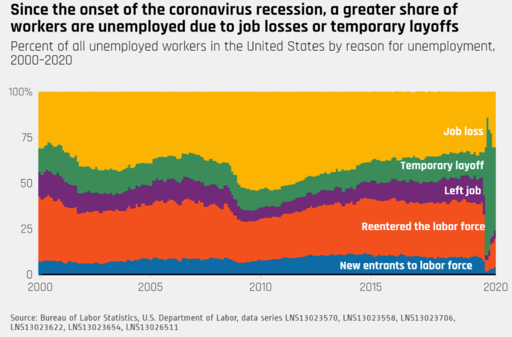
According to a report from Labor Department data, almost 25% of prime-age workers remain unemployed compared with pre-coronavirus levels.
Meanwhile, among the job losses because of the shutdown, 30.6% are permanent.
Permanent job losses have soared since the pandemic’s onset. | Source: Equitable Growth
Chinmay is an India-based financial journalist who likes writing about the U.S. stock market and precious metals. Formerly, he has written for the Times of India and First Print newspaper. Reach out to him at [email protected] or on his LinkedIn profile.